
Metrics have been used for years by NIMBYs, YIMBYs, municipalities and numerous other groups to fight for their desired outcomes, but most metrics they use are seriously flawed because they tell us little about either the quality of existing places or the quality of developments proposed to replace them. A classic example is living units per acre, or other land are of choice. The two places in the image above, Pienza, Italy and Pruitt-Igoe, a housing project in St. Louis, had roughly the same number of units per acre. Pienza is such a great place that it has been designated a UNESCO World Heritage Site. Pruitt-Igoe was so notoriously violent and inhumane that on the day of its demolition, former residents were accompanying the countdown with chants of “Blow it up! Blow it UP!! BLOW IT UP!!!”
Units per acre is such an unintelligent metric that it can’t tell the difference between utopia and dystopia. Or in the words of Hotel California, “This could be heaven or this could be hell…”
Quality-blind metrics that can’t tell the difference between the best and the worst of places have long prompted me to oppose all architecture and urbanism metrics, but I’ve come to realize recently that some metrics actually can tell us quite a lot about the quality of a place they are measuring. I presented over 40 such metrics at the International Making Cities Livable symposium in Cortona, Italy last fall. What follows is a dozen of those metrics, one for each foundation of the Original Green.
At this point, the proposed metrics include only what to measure, but draw no conclusions about normative ranges, calibration to places, or other characteristics. The intent is to post the 40+ metrics on a wiki and invite urbanists to both comment and also to propose their own quality-based metrics. The ultimate goal is a tool able to measure both the existing conditions and the project proposed to replace them and draw a meaningful conclusion as to whether the proposed project is an upward trade or a downward trade.
Nourishable Places
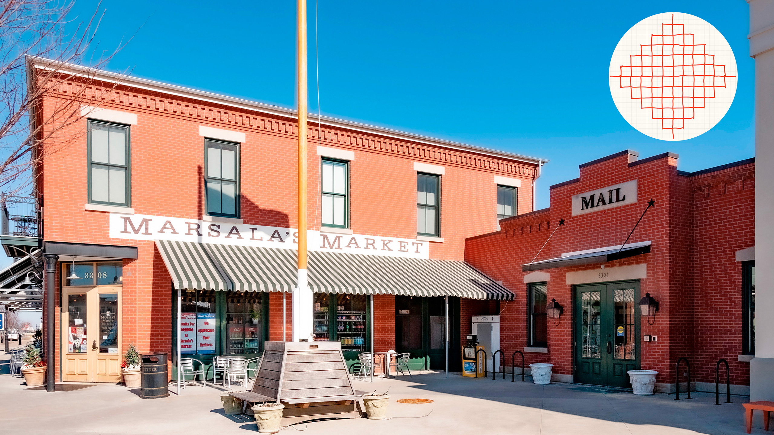
Neighborhood Markets/720 Acres
Before getting into the particulars of this metric, it’s important to understand the basis of the acreage denominator in this and several other metrics. The diagram in the upper right of the image above highlights problems associated with two common calculations of “walking radius,” or “walk shed.” The Perry Diagram of the early 20th Century proposed a five-minute walk as the maximum distance US residents would walk instead of driving, and it came to be widely known as the “quarter-mile radius,” because most people can walk a quarter mile in about 5 minutes. Unfortunately, the radius is a mirage because humans don’t fly; we walk in urbanism along streets. The upper right diagram shows that in a regular grid, a quarter mile walk (or any distance of walk, for that matter) gains access to a diamond-shaped land area substantially less than that which a quarter-mile radius includes. And for some who use the square area with height and width being a half mile (quarter mile from center to edge) the diamond of actual walking distance along streets is exactly half the land area of the half mile square.
The acreage used throughout this post is based on the diamond diagram of actual distance walked along streets in a regular grid. A 5-minute walk from center to points of the diamond includes 80 acres (0.5 miles square = 160 acres / 2 = 80 acres). A 15-minute walk from center to points of the diamond = 1.5 miles miles square = 1,440 acres / 2 = 720 acres). So the 15-Minute City includes 720 acres. Using these calculations, a 2-minute walk on the diamond includes a bit over 12 acres. The acreage denominator was used many times in the 40+ metrics of the IMCL presentation, but most of those have been edited out of this post in order to demonstrate other means of measurement.
The term Neighborhood Market as used here represents a robust neighborhood-scale establishment which stocks mostly food and drink items but also a number of other household goods as well, as was once found in the classic American corner store. A second type not pictured here is the Food Market, a smaller-scale establishment with only food and drink items. Its metric is markets per 80 acres.
It’s important to note that there is no judgment made as to whether one Neighborhood Market in 720 acres (15 minutes) is ample or not; it’s just the yardstick used to measure the frequency of Neighborhood Markets. In my experience, we have both a robust Neighborhood Market and a pharmacy that’s a 20-minute walk away, and I’ve made that walk countless times because the walk is so interesting due to its high Walk Appeal. And a 20 minute walk = a 1,280 acre diamond.

Accessible Places
Thoroughfare Length/View Change
The more quickly [your view](https://originalgreen.org/blog/walk-appeal-measurables “_blank") of adjacent buildings change, the more interesting it is to walk by. A building that requires 30 seconds to walk past is positively boring compared to a building that can be walked by in 8 seconds, for example, all other things being equal. A fabulous storefront display can be enthralling, but it can change by the week, or at most by the season whereas building widths are much more durable.
Serviceable Places
Properties/Acre
Jane Jacobs noticed decades ago that the more properties there are per acre, the more diverse the businesses and their offerings are likely to be in that district. This metric has come to be known as the Jacobs Diversity Standard. It’s noteworthy that diversity need not be scripted; given more properties in a given area, the more likely businesspeople are to produce a naturally-occurring richness of product and service offerings.

Securable Places
Percentage of Daylight Hours Free Range Children are in Civic Spaces
This is a strong test because few parents will let their children run free in public if there is much of a chance that ill-intentioned people are lurking nearby. The highest standard of activity is hide-and-go-seek because who would let their children hide in the presence of danger?

Lovable Buildings
Average Age of 12 Oldest Buildings/City Age
The closer a city’s oldest buildings are to the age of the city, the more likely they have proven to be so deeply lovable that the city will keep them well-maintained. A better but far more difficult metric would be the median age of all buildings divided by city age, but the data collection required would be immense for a large city. This metric highlights an underlying principle off all the metrics: look for simple indicators of complex conditions. Put another way: how few measurements do you need to take to get a reliably accurate metric? A system requiring days or even just hours to produce a trustworthy measure of a place is clearly more powerful than a system requiring months or years to reach a similar conclusion.

Durable Buildings
Life Expectancy of Prevailing Shell Assemblies
This metric sounds difficult to produce because the most thorough means of achieving it would be through a census of all buildings in a place, which would be immense for a large city. A much leaner approach would be that which political pollsters use: a scientifically-based sample that is a tiny fraction of the overall building count. Only the top 3-5 shell assemblies should be included because deep outliers can skew the overall metric.

Adaptable Buildings
Average Number of Building Corners
This metric is a classic example of a simple indicator of complex conditions. Architects have been taught “form follows function” ever since Louis Sullivan first uttered those words and Frank Lloyd Wright later merged them into “form and function are one.” Unfortunately, a building designed like a glove around the hand of function is highly unsustainable because once the function disappears or its physical implications change in major ways, the building becomes obsolete. The most adaptable buildings are simple in form, able to be used for many things over time. The best test for simple massing is a count of the exterior building corners in plan. A corner test is also a good test for economy because buildings that break and wiggle all over are likely to be a lot more expensive than those that are calmly composed.
Frugal Buildings
Linear Feet of Thoroughfare/Street Tree
At first glance, this metric seems completely disconnected from the frugality of buildings, but the most effective way of reducing building heating and cooling usage isn’t to spend a lot of money on marginally more efficient equipment. Instead, the best process is to condition ourselves to the local environment to achieve a state known as Living in Season. Doing so allows us to throw the windows open on all but the more extreme days of the years, at which point we discover that there is no equipment so efficient as that which is off.
We condition ourselves best to Living in Season by enticing ourselves outdoors into great private realms like courtyards and other outdoor rooms and great public realms like streets, plazas, squares, greens, parks, and playgrounds. Great public realms have the added benefit of requiring walking, which better helps condition us. Street trees are the most significant elements in enticing us out into great public realms because there are so many [virtuous cycles](https://originalgreen.org/blog/the-powerful-virtuous-cycle “_blank”) spawned by street trees. Hence, as disjointed as it seems, street trees are some of the most important elements in reducing energy use in buildings, not because they change the buildings, but because they change us.

Learning Society
Elementary Schools/2 Square Miles
I walked a bit over a mile to elementary school with a group of kids from my block in decent weather, but that was beside a 5-lane arterial with the only redeeming virtue being that the sidewalk was set back 15 feet from the travel lanes with an open drainage ditch in between, so an out-of-control car would by highly unlikely to ever reach the sidewalk. A 1-mile walk on the diamond introduced in Nourishable Places encompasses 2 square miles of catchment area. This doesn’t imply that it’s OK for a group of kids to walk a mile to school today just because I did so in the late 60s and early 70s, but it’s a metric I lived for several years so I know from experience it can be done. And today, parents in many places accompany groups of kids to school in the morning and home in the evening in “walking school busses.” The school in the photo above, for example, has walking school busses on most days of the school year based on weather conditions.
Prospering Society
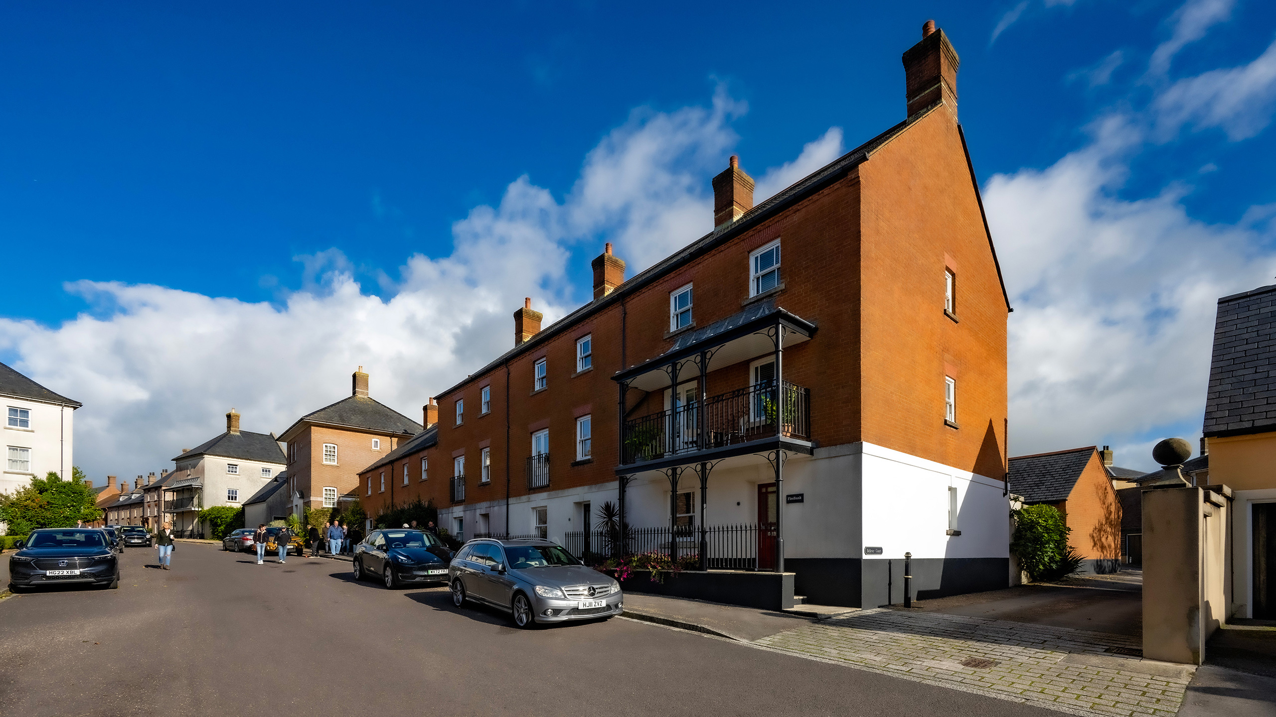
Neighborhood Range of Values (15:1 US, 40:1 Europe, Rent & Own)
I know of no single metric that is a better predictor of grassroots economic development than the range of housing values within a neighborhood. Pre-automobile, neighborhoods, hamlets, villages, and towns around the world had wide ranges of values because human transport first and horse transport second (because not everyone had a horse) limited how large people’s [Web of Daily Life](https://originalgreen.org/blog/the-tuscaloosa-astonishment “_blank") could be. Many places had ranges of values significantly greater than 40:1 in the pre-internal-combustion-engine era; that metric comes from decades of research by famed Bahamian developer Orjan Lindroth who observed that a 40:1 range of housing values (rent or own) is the threshold at which startup entrepreneurs had better-than-average chances of getting off the ground, and once they did, both the business owners and their employees could live there, reducing everyone’s transport burden.
This metric differentiates between the US and Europe (and other parts of the world as well) because the US became the epicenter of standards of the Industrial Development Complex in part because of the exodus of Modernists from Europe pre-WWII to the US. Industry seeks to mass-produce products (housing) in a very narrow range of values for efficiency’s sake, so a neighborhood with a wide range of values is anathema to the Industrial Development Complex, which has gone so far as to invent mythologies purporting that people only want to live near people very much like them. In reality, “everyone just like me” is a recipe for boredom. But in spite of that, many subdivisions in recent decades have pods varying by little more than 5% in value. A 15:1 range of values is 300 times as much.
I use the 15:1 metric for the US, even though it is 300 times out of line with typical development practice here because Orjan recommended backing off the globally-proven 40:1 range of values, which would be 4,000 times out of line with US development practice, and because at 15:1, much grassroots economic development still works. We set out two decades ago to develop a neighborhood with a 15:1 range of values near Montgomery, Alabama, and we achieved it. The least expensive cottages sold for $165,000, just a few blocks from a $2.5 million mansion. Today, of course, they’re all more expensive so you have to keep building the most affordable ones. The image above is Poundbury in the UK; King Charles’ development. It has a wide range of values and it’s impossible to tell which units are social housing and which are market rate. If a wide range of values is good enough for the King’s town, why not your town?

Enjoying Society
Third Places/720 Acres
Most would know that a Third Place accompanies home (First Place) and work (Second Place) as the places we inhabit most, if you don’t count the car. It can be a cafe, a bar, a coffee shop, or other venues where (as in the old Cheers tag line) “everybody knows your name,” and where you’re free to buy something and stay awhile. This and the Nourishable Places pattern near the beginning are the only two in this post that use the 720 acre metric of the 15-Minute City. As noted earlier, this is not to say that there should be only one Third Place in 720 acres. This image is from Paris, and in any given 720 acre quarter of Paris there are likely dozens of Third Places. So for this pattern, the more, the better; 720 acres is simply the metric chosen with which to measure Third Places.

Healing Society
Playgrounds/12 Acres
Unlike previous acreage/square mile metrics, this one calibrates what is considered by many to be a healthy level: a 2-minute walk to play. As noted earlier, a 2-minute walk is a bit over 12 acres on the diamond. So a place with less than 1.0 dedicated play places per 12 acres is deficient, whereas a place with more than 1.0 play places per 12 acres is doing well. And play places can run the gamut from parks to playgrounds with dedicated equipment to sport courts to inner-block rambles to splash fountains like the one pictured here. And because the measure is play places per 12 acres, most of them should be small; a basketball goal on an alley or rear lane counts as much as a splash fountain. At the end of the day, it’s simply a place to play.

